Week 2, Lecture 1 Perception IMAGE 1
Contextual Information:
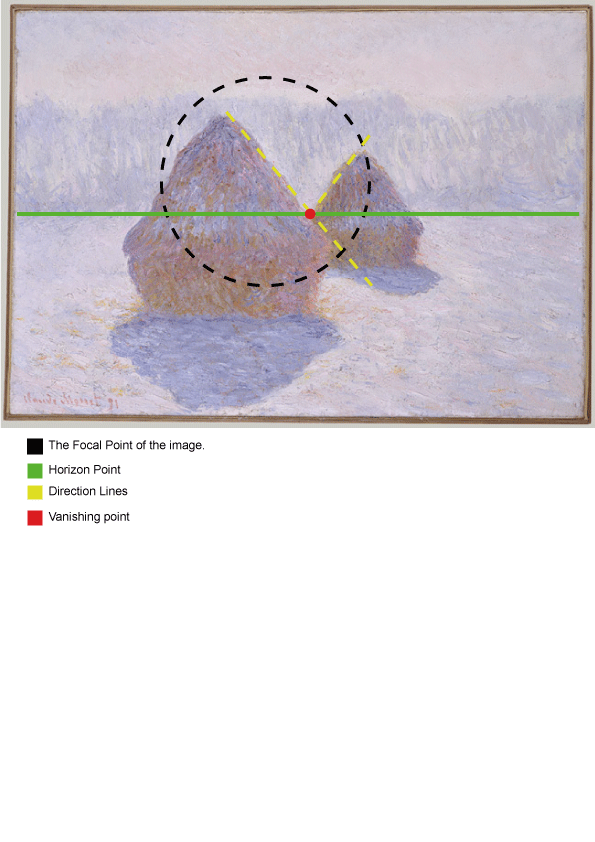
Artist: Claude Monet
Title: Haystacks (Effect of Snow and Sun)
Year of Creation – 1891
Dimensions: 64.4 x 92.1cm
Collection/Source: The Metropolitan Museum of Art
Technique, Material – Oil Painting on Canvas
Genre – Landscape Oil Painting
http: http://www.metmuseum.org/toah/works-of-art/29.100.109
Analysis Using Compositional Interpretation
This image depicts Haystacks during the daytime in the snow. The main hues used are a mixture of blues for the snow and yellow-ey green for the haystacks. Both generally at low saturation levels only increasing in value to accentuate the effect of shadows.
Monet has created a focal point by four main techniques. The first is by creating a ‘frame’ of the snow with the higher value blue streak in the middle cushioned by lower value blues above and below it forcing the viewer to focus on a particular segment.
The second is by utilizing the natural directive lines of the haystack shape to create a ‘V’ area where the eyes tend to be drawn to.
The close proximity of the two haystacks also encourages the observer to view them as a unit helping to focus attention
the last usage is mainly the colour contrast between the blue snow and the yellow-ey green hay which draws the viewer in.
Lesson Learnt
I learnt that it’s possible to create an image that gives the sense of space but through using different values of the same hue, it’s possible to create a focal point to draw the viewer.
Week 2, Lecture 1 Perception IMAGE 2
Contextual Information:
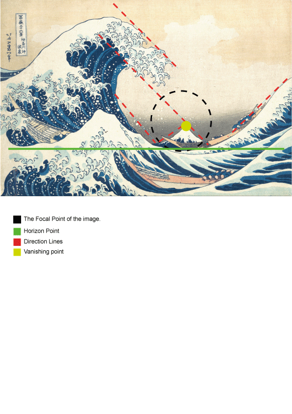
Artist Katsushika Hokusai
Title: The Great Wave off Kanagawa
Year of Creation – Between 1830 – 1833
Dimensions 25.7cm x 37.9cm
Collection/Source: The Metropolitan Museum of Art
Technique, Material: Polychrome Woodblock Print; Ink and Colour on Paper
Genre – Landscape Painting
Analysis Using Compositional Interpretation
http://www.metmuseum.org/collection/the-collection-online/search/45434
This image depicts a great wave and sailors in boats near with a mountain.
The image is highly saturated hues of blue, white, black and yellow/green.
The main strength of this image is the dynamic feeling of the waves creating natural direction lines for the eye to follow, bringing the viewer to the mountain in the centre of the image. This focus is assisted by the highly saturated whites of the sea froth which creates a natural frame towards the mountain and the bluish black hue around the mountain creates a contrast which “traps” the eye of the viewer.
What I learned.
This piece gave me a higher appreciation of how to deconstruct art and the way that compositional analysis can be applied to artwork of different cultures in different time periods.
Student Name: Benjamin Leong
Week 3 Semiotics IMAGE 1
Contextual Information:
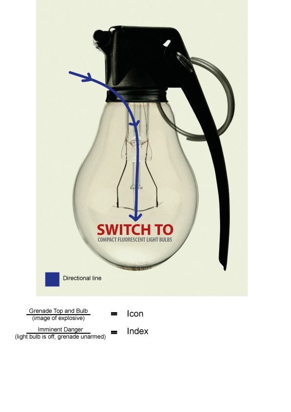
Artist: Takanori Matsumoto
Title: Switch to Compact Fluorescent Light Bulbs
Year of Creation – 2009
Dimensions 50cmx70cm
Collection/Source: World Wildlife Fund
Technique: Digital Print
Genre – Advertisement
http://posters.panda.org/poster/22/switch-to-compact-fluorescent-light-bulbs
Extra Info: http://good50x70.org/2009/gallery/climate-change/#poster6
Analysis:
The eye is lead through the top left of the grenade top with a lighting highlight. And is drawn down by the vertical shape of the grenade and light filament and stops at the horizontal text. The text is anchoring directly telling the viewer to do something.
The image creates a sense of danger in two ways. The first is the combination of two icons, a bulb and the grenade top to create direct reference to an explosive.
The second is the fact that the light filament is off and the grenade is in an unarmed position creating a sense of fear and danger.
What I learned
I learned that it’s important to also consider what the image is ‘not’ saying and how that can create another layer of meaning to a composition.
Student Name: Benjamin Leong
Week 3 Semiotics IMAGE 2
Contextual Information:
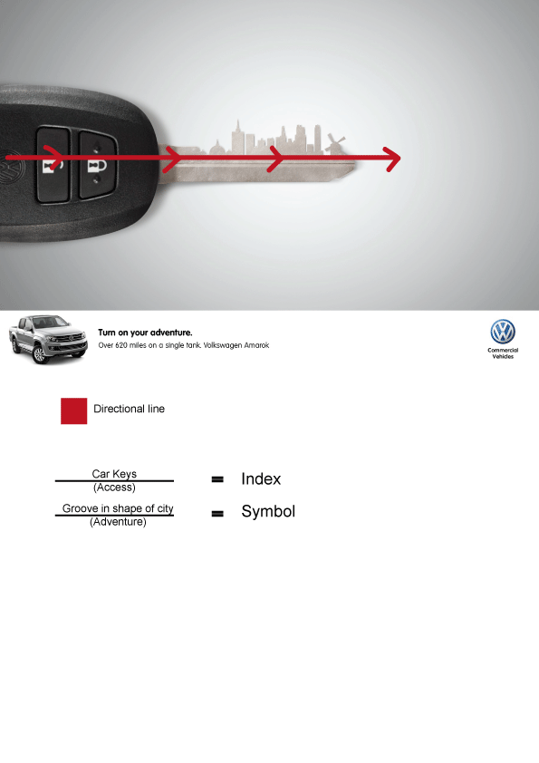
Artist: Christian Rivera, Marco Tantalean
Title: Turn on your adventure
Year of Creation – 2012
Dimensions unknown
Collection/Source: Ads Of The World
Technique: Digital Print
Genre – Advertisement
http://adsoftheworld.com/media/print/volkswagen_amarok_city?size=original
Analysis:
This ad denotes a car key with the grooves changed into a city landscape, it contains text, car and logo.
The eye is drawn from left to right by the key coming in from “off screen” and is focused by the slight gradient effect by the greyish blue hue changing from high to low value as it draws toward the middle of the image.
This image promotes adventure firstly through the key itself indexing the idea of accessibility followed by the cityscape symbolising the ability for exploration
The bolded “Turn on your adventure” is a relay text further enforcing the idea of exploration/adventure and the text below is anchorage, clearly stating what the vehicle is capable of.
What I learned
The act of combining different images can create a convincing narrative and evoke certain feelings and expectations.
Student Name: Benjamin Leong
Week 4 Visual Social Semiotics IMAGE 1
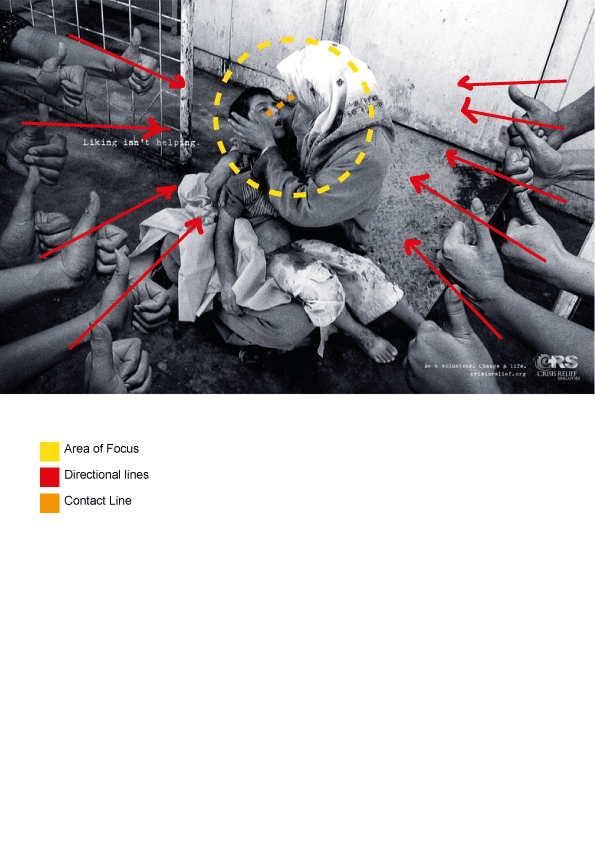
Contextual Information:
Artist: Sebastian Siah | Publicis Singapore
Title: “Liking Isn’t Helping” Crisis Relief Singapore Campaign
Year of Creation – 2014
Dimensions unknown
Collection/Source: Dandad
Technique: Wood Pencil, Outdoor Advertising, Photograph
Genre – Advertisement
http://www.dandad.org/awards/professional/2014/outdoor-advertising/23143/liking-isnt-helping-war/
Analysis
The main focal point of this image is the face of the child. This is created by the directional lines of the many hands extending towards the child effectively creating a frame due to their close proximity. It is also assisted by the high level of salience of the woman’s veil, the boy’s pants and the blanket helping to frame attention at the child.
The viewer experiences a high point of view looking down on the scene giving a sense of power at a medium distance shot connecting the viewer socially to the scene.
The contact of the child is towards the woman’s face creating a very private moment which is assisted by the high level of modality.
What I learned
By using visual social semiotics effectively a designer is able to create awareness and draw the viewer into moments that might otherwise may never occur in daily life in a 1st world country.
Student Name: Benjamin Leong
Week 4 Visual Social Semiotics IMAGE 2
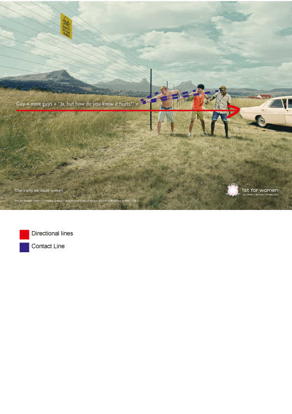
Contextual Information:
Artist: Clive Stewart, Suhana Gordhan | Black River FC Johannesburg SA
Title: 1st for Women Insurance Brokers: Fence
Year of Creation – 2013
Dimensions unknown
Collection/Source: Ads Of The World
Technique: Photograph Digital Print
Genre – Advertisement
http://adsoftheworld.com/media/print/1st_for_women_insurance_brokers_fence?size=original
Analysis
This image is an ad for an insurance company insuring women only in South Africa.
The text is a narrative adding more context for the actions of the men by adding an extra story on the thought process and conversation of the characters.
The contact lines of the men are all directed towards a point where the hand is about to meet the electric fence. drawing the viewer to that area.
Salience is used in this image through the greying grass and creating a frame/stage for the characters.
The long shot creates a sense of a bystander from a safe distance who’s able to view the whole scene
what I learned
Depending on the distance of the image different effects may take place. If the shot were closer like the Crisis Singapore composition then the feeling would change from bystander to a person within the social circle of the men looking on, possibly taking part in touching the wire.
Student Name: Benjamin Leong
CI and Monaco’s Syntax
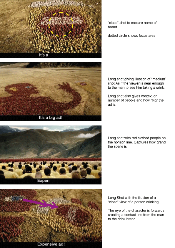
Contextual Information:
Artist: George Patterson and Partners
Title: The “Big Ad”
Year of Creation – 2005
Genre – Advertisement
https://www.youtube.com/watch?v=_wM2c3WtDjQ
Analysis
The colour scheme utilises highly saturated hues to help differentiate the people from the background.
The sequence is shot in 2.35:1 Cinema Scope to add a sense of grandness to the commercial but also, due to the fact that many individuals are being caught on frame the shots are required to be very far.
this ad utilizes the key factor in gestalt theory of proximity to create larger images out of individuals
To bring attention to everything the sequence is all in focus allowing the viewer to see all the action.
The framing for the first two screenshots are open, leaving space for the viewer to “run” with the characters. The latter two shots are closed utilizing the mountains to help draw the viewer to the horizon line where more people stand, the last creates a frame via hues where the beer is being poured into the mouth.


